Logo Concept: The Grind
We're a small coffee shop chain located in Seattle, WA with five locations.
Our current logo is just text using a default font but now it's time for an update!
Our current logo is just text using a default font but now it's time for an update!
The Grind prides itself on natural and local ingredients. For our new logo, we actually do not want to use any browns!
So many coffee shops around here use brown and we'd like to stand out. Maybe oranges, green, other earth tones, etc. could work well.
So many coffee shops around here use brown and we'd like to stand out. Maybe oranges, green, other earth tones, etc. could work well.
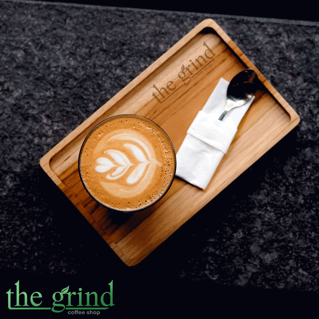
This logo will primarily be used as our store sign, on menus, and on coffee cups and merchandise.
The Grind logo could be text based or have an icon, we're open to either/both.
We're open to using symbols that represent coffee such as the coffee bean, plant, grounds, coffee cup, etc.!
The Grind logo could be text based or have an icon, we're open to either/both.
We're open to using symbols that represent coffee such as the coffee bean, plant, grounds, coffee cup, etc.!
Thanks,
Edgar Martin
The Grind Coffee Shop
Edgar Martin
The Grind Coffee Shop


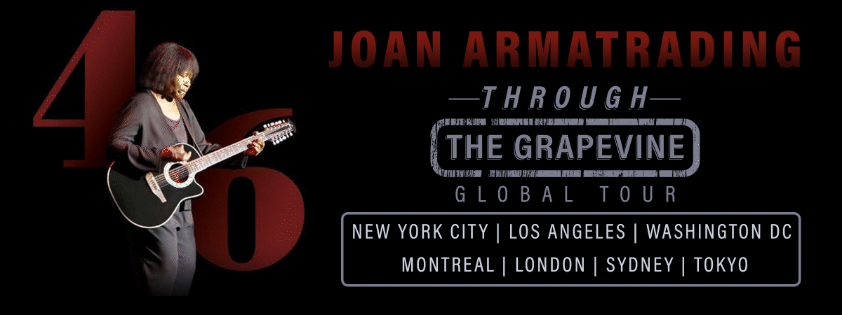
Logo Concept: The Grapevine
Urban Vines Entertainment is seeking to create a unique and vibrant urban live music space,
called The Grapevine, that celebrates the fusion of wine culture and live music.
called The Grapevine, that celebrates the fusion of wine culture and live music.
The goal is to provide a memorable experience for music enthusiasts and wine connoisseurs alike,
offering an inviting and sophisticated atmosphere that blends the best of both worlds.
offering an inviting and sophisticated atmosphere that blends the best of both worlds.
This project aims to transform an existing space into a wine-centric urban live music venue that appeals to a diverse audience.
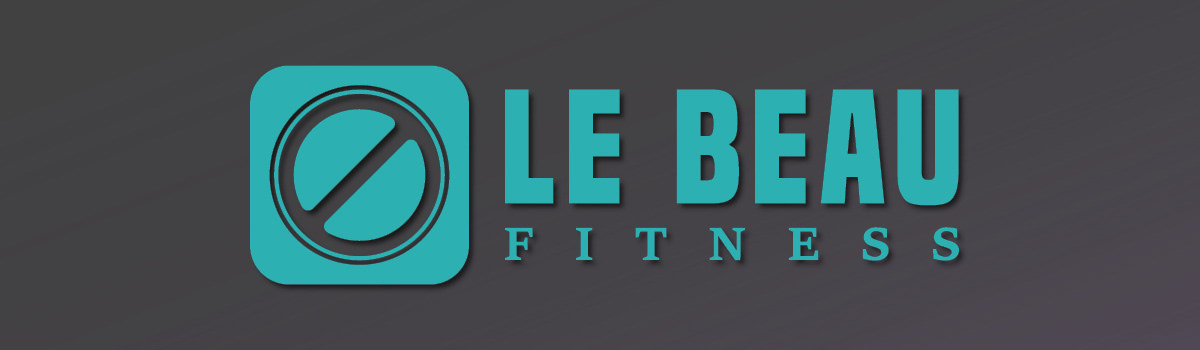
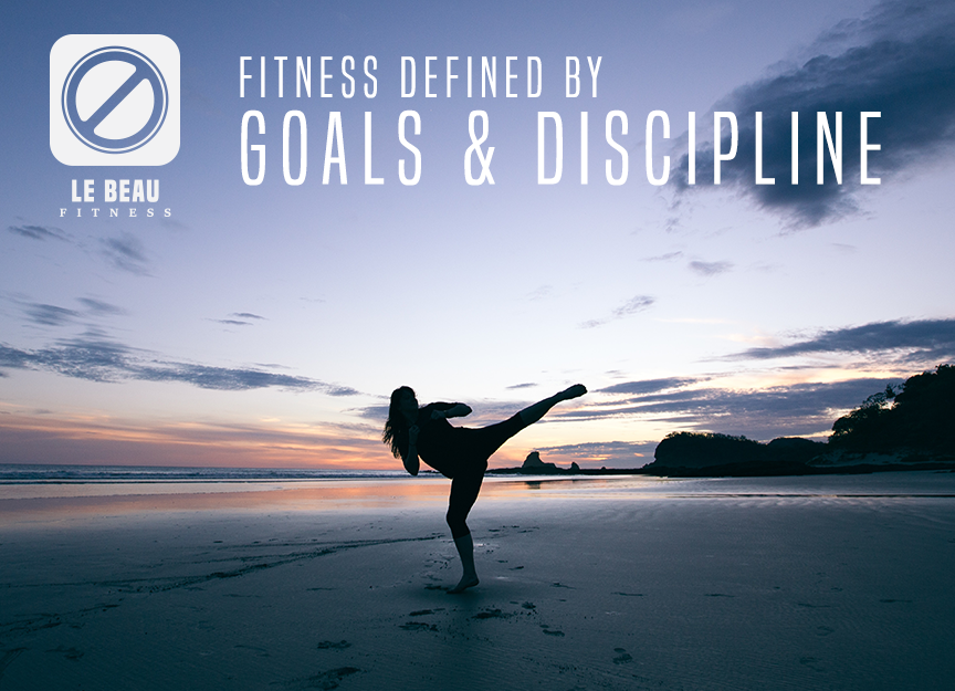
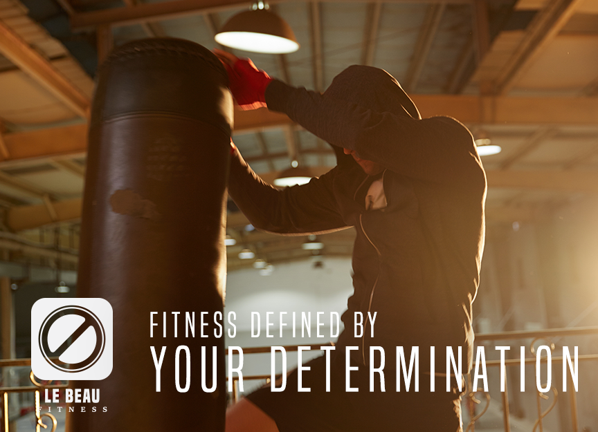
Logo Concept: LeBeau Fitness
LeBeau Fitness is dedicated to creating an inclusive and safe fitness environment
where individuals of all gender identities can pursue their health and wellness goals comfortably and confidently.
where individuals of all gender identities can pursue their health and wellness goals comfortably and confidently.
This project aims to develop a brand identity and marketing strategy that reflects LeBeau Fitness' commitment to diversity,
respect, and empowerment, emphasizing the welcoming and non-discriminatory nature of their fitness spaces and programs.
respect, and empowerment, emphasizing the welcoming and non-discriminatory nature of their fitness spaces and programs.